

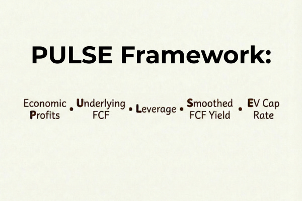
The PULSE Framework: Start With the Vitals, Not the Narrative
How I use 5 vital signs from all three financial statements to quickly tell if a stock deserves my time

Management loves to tell you rosy stories. Wall Street wants you to buy what it is selling, which typically means just amplifying what management is saying. Your own mind likely anchors on what you first hear, which if you make it management commentary or Wall Street opinion is likely to leave you with a serious bias.
There's a better way. I have used the PULSE framework for over a decade to cut through the hype and to quickly get to the vital signs of what each stock is all about.
No, this is not going to tell you whether a stock is a buy in a minute or less. Nothing can do that.
What the PULSE framework can quickly tell you is a lot about the business's past key financials as well as the stock's current valuation and financial strength, tying in information from all three financial statements. In less than a minute you should know whether the stock falls into one of three categories:
Not interesting
Attractive company at a high price
Attractive company at an interesting price
This allows you to prioritize your research time and only spend it where it's most likely to be rewarded. Furthermore, it anchors you to the relevant historical truth about the business, which you can then supplement with additional research, management commentary, and all the other factors that you should take into consideration prior to making your final investing decision.
If you apply the PULSE framework correctly it will save you a lot of time and allow you to spend it where you are most likely to make money. This is where you should start your work, but not where it ends. Imagine how much better your investing will be if you can spend all your efforts on the most promising opportunities that you already pre-vetted.
Let's unpack the PULSE framework and why it works so well.
The “P” stands for Economic Profit, which is defined as:
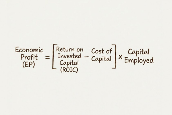
It's a much better financial metric than ROIC. Why?
A quick story might illustrate the point. When I was interviewing for my research job at Fidelity 25 years ago, I was asked the following question: What's better: a 20% ROIC or a 15% ROIC?
I had no idea at first. Luckily I said the right thing by accident: “I'm not sure.”
The missing variable, of course, is how much capital can be invested at each rate. Both 15% and 20% are high rates of return, there is no doubt about that.
However wouldn't you rather invest $1 million at a 15% ROIC than $1,000 at 20%? That's why Economic Profit is a much better metric. It measures not just the rate of return but the combination of the rate with how much capital is invested at that rate.
What's even better than Economic Profit? It's Economic Profit over time. Seeing the history of Economic Profits year after year over a couple of decades tells you a whole lot about a business.
How? It is easiest to illustrate it with three examples.
The first example shows you a dream scenario: positive and rising Economic Profit over time. The second example shows you a company with positive Economic Profits but ones that aren't meaningfully rising. Finally the third example shows you a company with negative Economic Profits. That's the kind of business it's better to avoid.
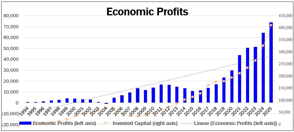
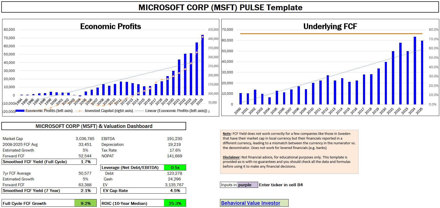
This is the Economic Profit chart of Microsoft (ticker: MSFT)
The chart is very attractive - it has positive, rising Economic Profits over a long period of time
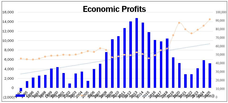
This is the Economic Profit chart of IBM (ticker: IBM)
The chart shows a picture of a business that is still earning excess economic profits that are no longer increasing
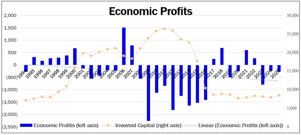
Our final Economic Profit chart is of Alcoa (ticker: AA)
The chart is clearly unattractive, with the business under-earning its cost of capital over time
The “U” stands for Underlying FCF which is defined as:
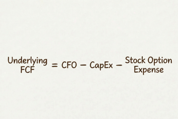
The reason that we want to adjust Free Cash Flow for stock option expenses is because they are a real cost. Subtracting the reported accounting cost of stock option expenses is not perfect. However it's quick and it's consistent across companies.
Later on if you decide the stock is worth a deeper dive, you can make more thorough adjustments. At this point this is good enough.
One other thing you want to consider together with FCF is how it compares to net income over time. Companies that are experiencing only moderate growth should have FCF in the 75% to 100% of net income range. Otherwise you can legitimately begin to doubt the quality of the company's reported profits.
Of course FCF can be lumpy and is allowed to vary a lot year to year. So the relationship between it and net income is best assessed over a long period of time.
Staying with our three example companies we used earlier for Economic Profits, you can see each company's FCF over time. The blue bars are FCF in each year (left axis) while the red line is the 10-year ratio between FCF and net income (right axis).
This is the FCF chart of Microsoft (ticker: MSFT)
It’s a very attractive chart with positive and rising FCFs
The ratio between FCF and Net Income over the last decade is close to 80%, which is a good level for a growing business
Our second FCF chart is of Kimberly Clarck (ticker: KMB)
The FCFs are nicely positive and the conversion ratio is excellent, near 90%
However, unlike in the first chart the FCFs aren’t increasing much over time
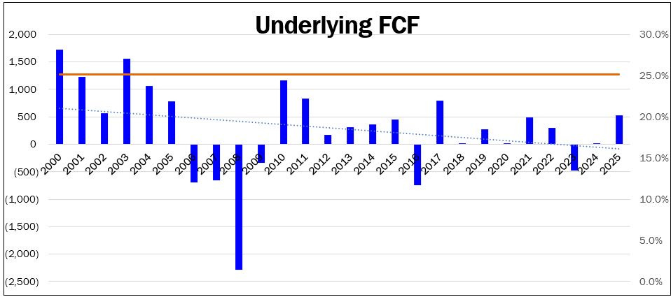
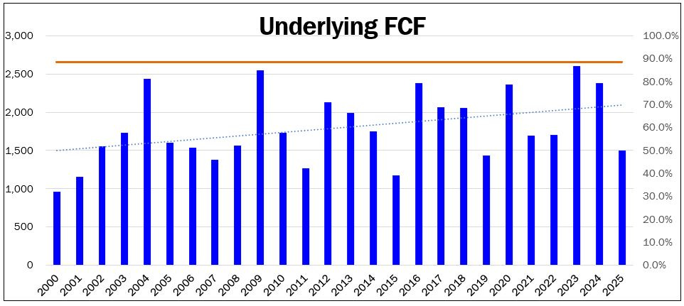
Our final FCF chart is of Alcoa (ticker: AA)
This is a very unattractive chart as the FCFs are frequently low or negative and the conversion ratio of about 25% is very low
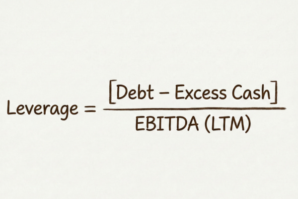
The “L” stands for Financial Leverage, which is defined as:
Financial leverage is an important consideration for any stock. Too often beginners are fooled by a low Price-to-Earnings (P/E) ratio for a company that is way over-levered.
The problem is two-fold. First, high financial leverage increases the chance of either bankruptcy, where equity shareholders can lose everything, or being a forced issuer of securities, where their ownership can get diluted.
Second, a company that is over-levered must use its FCF to pay down debt. That means that some initial amount of the FCF stream isn't really free to be used by shareholders as they wish, but instead must be used to reduce debt.
There are many robust ways to assess a company's financial health. However, given how we're using the PULSE framework to screen ideas in the initial pass, we want something that's both good and quick. For that purpose I find Net Debt/EBITDA works well.
There are definitely nuances in terms of how much debt different businesses can carry safely. However a good rule of thumb for an industrial company is that a BBB investment grade rating corresponds to leverage in the 2.5x to 3.5x range. Anything above 4x is definitely suspect.
The “S” stands for Smoothed FCF yield, which is defined as:
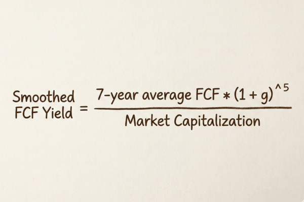
This is the single best quick valuation metric that I know. It combines FCF, which unlike accounting earnings, is far less subject to manipulation, with looking at profits over a number of years.
In an ideal world we would choose a number of years corresponding to a full economic cycle. That way we're looking at a company's profitability through both good, bad, and middle-of-the-road periods.
However economic cycles can vary in length. The longer you make this period, the more likely it is that the business has now changed in some material way versus what it was, say, 10+ years ago. Perhaps the company has acquired or sold a material division or evolved in some other meaningful way.
So there's a trade-off between using a period that's fully representative of an economic cycle and using a period that's still relevant for the company the way it is today. In practice I find that a 7-year average works well. However, as you'll see in the template, I also supplement it with a second, longer, period which allows me to measure it in two different ways.
In order to make this Smoothed FCF yield comparable to a 12-month forward Free Cash Flow yield, we want to bring that average forward the appropriate number of years, at our estimate of the long-term growth rate of the business.
The “E” stands for EV Cap Rate, which is defined as:
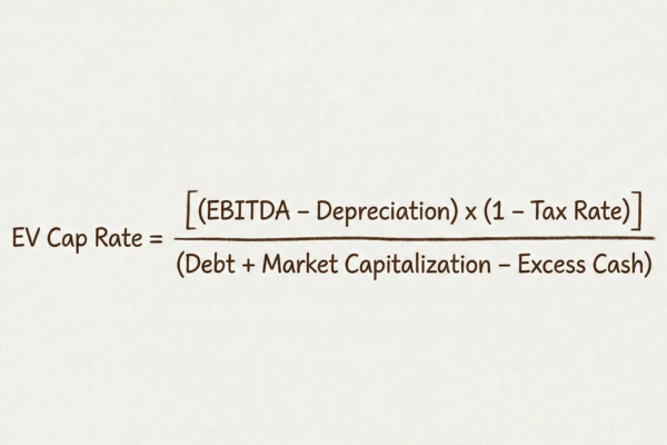
The EV cap rate supplements the Smoothed FCF yield in two important ways:
It uses the last 12-month period of profitability, which is more current than a multi-year average.
It incorporates the market value of both equity and other sources of capital, like debt and preferred securities.
This helps you avoid falling for the “look, it's cheap: the FCF yield is high” trick. I have seen it many times when a PE firm IPOs a company, and leverages it to the hilt - way past the sustainable level. It then tries to sell it to the suckers at a low P/E ratio or high FCF yield, hoping that they will ignore the unsustainably high levels of debt.
It doesn't need to be someone trying to trick you. This can also occur naturally in a distressed company that looks very cheap on a FCF yield basis, but really isn't when you consider the amounts of debt that it is carrying.
All valuation metrics are naturally imperfect. However using the Smoothed FCF yield and the EV Cap Rate together really allows you to quickly tell the valuation level of a stock.
Putting It All Together
Hopefully I showed you that the PULSE framework works to quickly get to the essence of what each stock is about. Everything I just walked you through can be done by hand, but it's slow. That would defeat the purpose, as you don't want to commit a lot of time for a stock you aren't sure is worth it yet.
Don't worry, I have built a template that I've been using for over a decade, which pulls together all this data in under 10 seconds, allowing you to very quickly see each of the components of the PULSE framework.
With it I can screen through hundreds of stocks an hour, much more than I could do using anything else that I know. Here is what the output of the template looks like for the for Microsoft (ticker: MSFT) which we covered earlier:
To show you how quickly we can get all the essential information and make an informed decision on whether to proceed to doing more work on a stock, watch how I use the PULSE template to analyze 3 stock examples in this short video:
The PULSE template has saved me hundreds of hours and it has allowed me to really get to the essence of stocks quickly, helping me make money for myself and my partners. The template is available in two versions. The first allows you to build your own data connectivity using your preferred financial data provider. The second one is the actual template that I use in my professional investing, fully automated with Bloomberg codes. Both come with a complimentary month of the paid tier of the Behavioral Value Investor Substack. You can get it here.
Disclaimer: Not financial advice, for educational purposes only.
About the author

Gary Mishuris, CFA is the Managing Partner and Chief Investment Officer of Silver Ring Value Partners, an investment firm that seeks to apply its intrinsic value approach to safely compound capital over the long-term. He also teaches the Value Investing Seminar at the F.W. Olin Graduate School of Business.
Thanks for the post. Can you explain some more of the rationale behind the Smoothed FCF calculation, in particular multiplying the Avg 7 historic FCF by (1+g)^5? I'm guessing there might be an assumption that the mid point of the last seven years is T-4 years, so moving that forward 5 years and dividing by curent market cap gives T+1 normalised FCF yield? and if so, g should be average or sustainable growth of FCF?
This is very helpful, thank you! If you have a company like FTAI (not interested, just an example) one year ago, who is investing heavily in inventory, infrastructure, acquisition, etc., and FCF is terrible, net debt is still high-side, but you have economic profit starting to climb and EV cap rate is turning strong - is this a pattern you flag and dive into potentially?.... (thinking about this more I see now this gets down to your/our pattern-level comfort and proficiency as an investor).